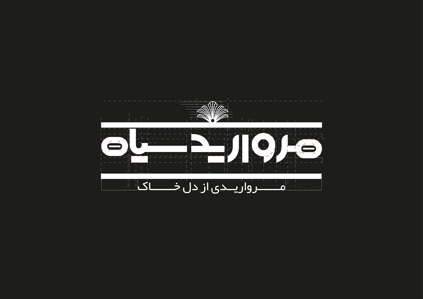
Morvarid Siah
July 26, 2023
Put Jadid
July 26, 2023Butterfly
Client
Butterfly
Industry
Beauty & Self-Care
Services
Digital
Brand Identity
Environmental
Motion
Naming
Pachaging
Print
Strategy
Tone of voice
Our solution was to channel the optimism, warmth and openness of the Bay Area. We developed the concept of ‘West Coast Energy’ which is represented in a timeless, dynamic new symbol — Reminiscent of a spark, or sun, the symbol shines back from the West Coast.
The flat, vertical left hand side of the logo represents the Pacific, while each ray points to each of the 9 unique counties which make up the Bay Area. The symbol also creates a large letter ‘D’ for Design.
The color palette represents the ‘Golden Hour’ — a unique light that hits the Bay Area and California at the end of each day as the sun sets in the West, featuring ‘International Orange’ — the color of the Golden Gate Bridge.


